code block
pacman::p_load(readxl, gifski, gapminder,
plotly, gganimate, tidyverse,
kableExtra) )](images/animatedchart.gif)
| Work done | Hands-on Exercise 3b |
| Hours taken | ⏱️⏱️ (sick fil) |
| Questions | 0 |
| How do I feel? | 🚚😵 |
| What do I think? | Animated plots are so cool when done right. I would like to learn more about how not to over do it. |
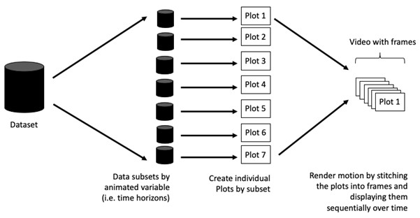
When telling a visually-driven data story, animated graphics tends to attract the interest of the audience and make deeper impression than static graphics.
When creating animations, the plot does not actually move. Instead, many individual plots are built and then stitched together as movie frames, just like an old-school flip book or cartoon. Each frame is a different plot when conveying motion, which is built using some relevant subset of the aggregate data. The subset drives the flow of the animation when stitched back together.
Before we dive into the steps for creating an animated statistical graph, it’s important to understand some of the key concepts and terminology related to this type of visualization.
Frame: In an animated line graph, each frame represents a different point in time or a different category. When the frame changes, the data points on the graph are updated to reflect the new data.
Animation Attributes: The animation attributes are the settings that control how the animation behaves. For example, you can specify the duration of each frame, the easing function used to transition between frames, and whether to start the animation from the current frame or from the beginning.
Before you start making animated graphs, you should first ask yourself: Does it makes sense to go through the effort? If you are conducting an exploratory data analysis, a animated graphic may not be worth the time investment. However, if you are giving a presentation, a few well-placed animated graphics can help an audience connect with your topic remarkably better than static counterparts.
The code chunk below uses p_load() of pacman package to check if the following R packages are installed in the computer. If they are, then they will be launched into R.
plotly, R library for plotting interactive statistical graphs.
gganimate, an ggplot extension for creating animated statistical graphs.
gifski converts video frames to GIF animations using pngquant’s fancy features for efficient cross-frame palettes and temporal dithering. It produces animated GIFs that use thousands of colors per frame.
gapminder: An excerpt of the data available at Gapminder.org. We just want to use its country_colors scheme.
tidyverse, a family of modern R packages specially designed to support data science, analysis and communication task including creating static statistical graphs.
pacman::p_load(readxl, gifski, gapminder,
plotly, gganimate, tidyverse,
kableExtra) The data set, GlobalPopulation.csv, contains the global population demographic numbers across years (including forecast), number of young people, number of old people, total population size and continent; and is uploaded as globalPop.
In the code chunk below,
read_xls() of readxl package is used to import the Excel worksheet.
mutate_at() or across() are used to replace mutate_each_() of dplyr package that is used to convert all character data type into factor.
mutate_each_() was deprecated in dplyr 0.7.0. and funs() was deprecated in dplyr 0.8.0
col <- c(“Country”, “Continent”) globalPop <- read_xls(“chap03/data/GlobalPopulation.xls”, sheet=“Data”) %>% mutate_each_(funs(factor(.)), col) %>% mutate(Year = as.integer(Year))
mutate of dplyr package is used to convert data values of Year field into integer.
Using mutate_at()
col <- c("Country", "Continent")
globalPop <- read_xls("data/GlobalPopulation.xls",
sheet="Data") %>%
mutate_at(col, as.factor) %>%
mutate(Year = as.integer(Year))Using across()
col <- c("Country", "Continent")
globalPop <- read_xls("data/GlobalPopulation.xls",
sheet="Data") %>%
mutate(across(col, as.factor)) %>%
mutate(Year = as.integer(Year))head():head(globalPop,5) %>%
kbl() %>%
kable_material()| Country | Year | Young | Old | Population | Continent |
|---|---|---|---|---|---|
| Afghanistan | 1996 | 83.6 | 4.5 | 21559.9 | Asia |
| Afghanistan | 1998 | 84.1 | 4.5 | 22912.8 | Asia |
| Afghanistan | 2000 | 84.6 | 4.5 | 23898.2 | Asia |
| Afghanistan | 2002 | 85.1 | 4.5 | 25268.4 | Asia |
| Afghanistan | 2004 | 84.5 | 4.5 | 28513.7 | Asia |
str():str(globalPop)tibble [6,204 × 6] (S3: tbl_df/tbl/data.frame)
$ Country : Factor w/ 222 levels "Afghanistan",..: 1 1 1 1 1 1 1 1 1 1 ...
$ Year : int [1:6204] 1996 1998 2000 2002 2004 2006 2008 2010 2012 2014 ...
$ Young : num [1:6204] 83.6 84.1 84.6 85.1 84.5 84.3 84.1 83.7 82.9 82.1 ...
$ Old : num [1:6204] 4.5 4.5 4.5 4.5 4.5 4.6 4.6 4.6 4.6 4.7 ...
$ Population: num [1:6204] 21560 22913 23898 25268 28514 ...
$ Continent : Factor w/ 6 levels "Africa","Asia",..: 2 2 2 2 2 2 2 2 2 2 ...There are 6204 rows and 6 variables. The output reveals that the variables have been assigned their correct data types.
globalPop[duplicated(globalPop),]# A tibble: 0 × 6
# ℹ 6 variables: Country <fct>, Year <int>, Young <dbl>, Old <dbl>,
# Population <dbl>, Continent <fct>There were no duplicated rows found in globalPop.
sum(is.na(globalPop))[1] 0There were no missing values found in globalPop.
3.1 In Country
unique(globalPop$Country) [1] Afghanistan Albania
[3] Algeria American Samoa
[5] Andorra Angola
[7] Anguilla Antigua and Barbuda
[9] Argentina Armenia
[11] Aruba Australia
[13] Austria Azerbaijan
[15] Bahamas, The Bahrain
[17] Bangladesh Barbados
[19] Belarus Belgium
[21] Belize Benin
[23] Bermuda Bhutan
[25] Bolivia Bosnia and Herzegovina
[27] Botswana Brazil
[29] Brunei Bulgaria
[31] Burkina Faso Burma
[33] Burundi Cambodia
[35] Cameroon Canada
[37] Cape Verde Cayman Islands
[39] Central African Republic Chad
[41] Chile China
[43] Colombia Comoros
[45] Congo (Brazzaville) Congo (Kinshasa)
[47] Costa Rica Cote d'Ivoire
[49] Croatia Cuba
[51] Cyprus Czech Republic
[53] Denmark Djibouti
[55] Dominica Dominican Republic
[57] East Timor Ecuador
[59] Egypt El Salvador
[61] Equatorial Guinea Eritrea
[63] Estonia Ethiopia
[65] Faroe Islands Fiji
[67] Finland France
[69] French Polynesia Gabon
[71] Gambia, The Gaza Strip
[73] Georgia Germany
[75] Ghana Gibraltar
[77] Greece Greenland
[79] Grenada Guam
[81] Guatemala Guernsey
[83] Guinea Guinea-Bissau
[85] Guyana Haiti
[87] Honduras Hong Kong S.A.R.
[89] Hungary Iceland
[91] India Indonesia
[93] Iran Iraq
[95] Ireland Isle of Man
[97] Israel Italy
[99] Jamaica Japan
[101] Jersey Jordan
[103] Kazakhstan Kenya
[105] Kiribati Korea, North
[107] Korea, South Kuwait
[109] Kyrgyzstan Laos
[111] Latvia Lebanon
[113] Lesotho Liberia
[115] Libya Liechtenstein
[117] Lithuania Luxembourg
[119] Macau S.A.R. Macedonia
[121] Madagascar Malawi
[123] Malaysia Maldives
[125] Mali Malta
[127] Marshall Islands Mauritania
[129] Mauritius Mayotte
[131] Mexico Micronesia, Federated States of
[133] Moldova Monaco
[135] Mongolia Montenegro
[137] Montserrat Morocco
[139] Mozambique Namibia
[141] Nauru Nepal
[143] Netherlands Netherlands Antilles
[145] New Caledonia New Zealand
[147] Nicaragua Niger
[149] Nigeria Northern Mariana Islands
[151] Norway Oman
[153] Pakistan Palau
[155] Panama Papua New Guinea
[157] Paraguay Peru
[159] Philippines Poland
[161] Portugal Puerto Rico
[163] Qatar Romania
[165] Russia Rwanda
[167] Saint Helena Saint Kitts and Nevis
[169] Saint Lucia Saint Pierre and Miquelon
[171] Saint Vincent and the Grenadines Samoa
[173] San Marino Sao Tome and Principe
[175] Saudi Arabia Senegal
[177] Serbia Seychelles
[179] Sierra Leone Singapore
[181] Slovakia Slovenia
[183] Solomon Islands Somalia
[185] South Africa Spain
[187] Sri Lanka Sudan
[189] Suriname Swaziland
[191] Sweden Switzerland
[193] Syria Taiwan
[195] Tajikistan Tanzania
[197] Thailand Togo
[199] Tonga Trinidad and Tobago
[201] Tunisia Turkey
[203] Turkmenistan Turks and Caicos Islands
[205] Tuvalu Uganda
[207] Ukraine United Arab Emirates
[209] United Kingdom United States
[211] Uruguay Uzbekistan
[213] Vanuatu Venezuela
[215] Vietnam Virgin Islands
[217] Virgin Islands, British West Bank
[219] Western Sahara Yemen
[221] Zambia Zimbabwe
222 Levels: Afghanistan Albania Algeria American Samoa Andorra ... Zimbabwe3.2 In Continent
unique(globalPop$Continent)[1] Asia Europe Africa Oceania North America
[6] South America
Levels: Africa Asia Europe North America Oceania South AmericaThere were no string inconsistencies found in exam_data.
4.1 In Year
summary(globalPop$Year) Min. 1st Qu. Median Mean 3rd Qu. Max.
1996 2010 2024 2023 2038 2050 4.2 In Young
summary(globalPop$Young) Min. 1st Qu. Median Mean 3rd Qu. Max.
15.50 25.70 34.30 41.66 53.60 109.20 4.3 In Old
summary(globalPop$Old) Min. 1st Qu. Median Mean 3rd Qu. Max.
1.00 6.90 12.80 17.93 25.90 77.10 4.4 In Population
summary(globalPop$Population) Min. 1st Qu. Median Mean 3rd Qu. Max.
3.3 605.9 5771.6 34860.9 22711.0 1807878.6 There were no data irregularities found in globalPop.
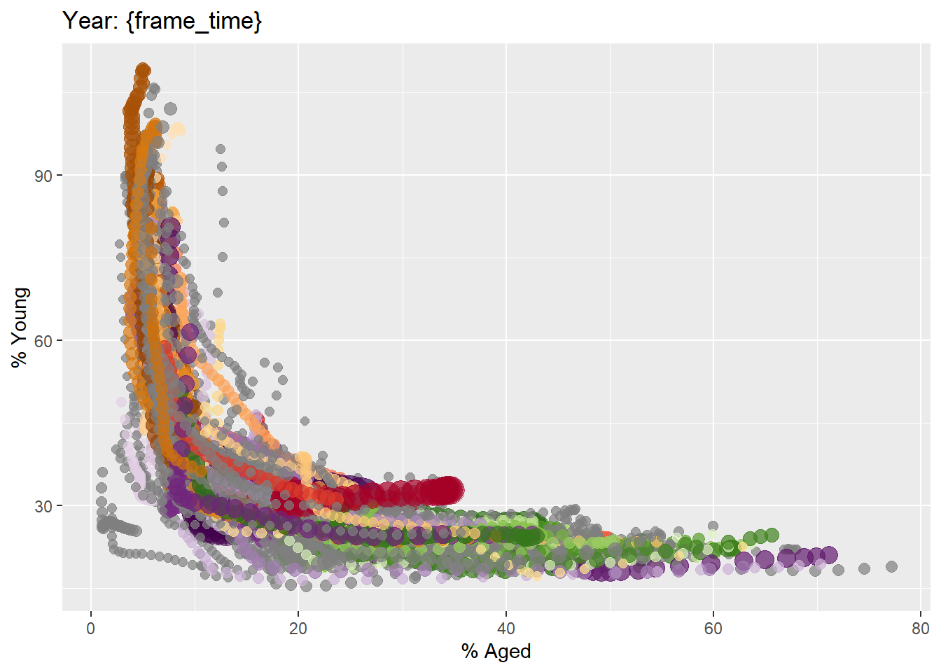
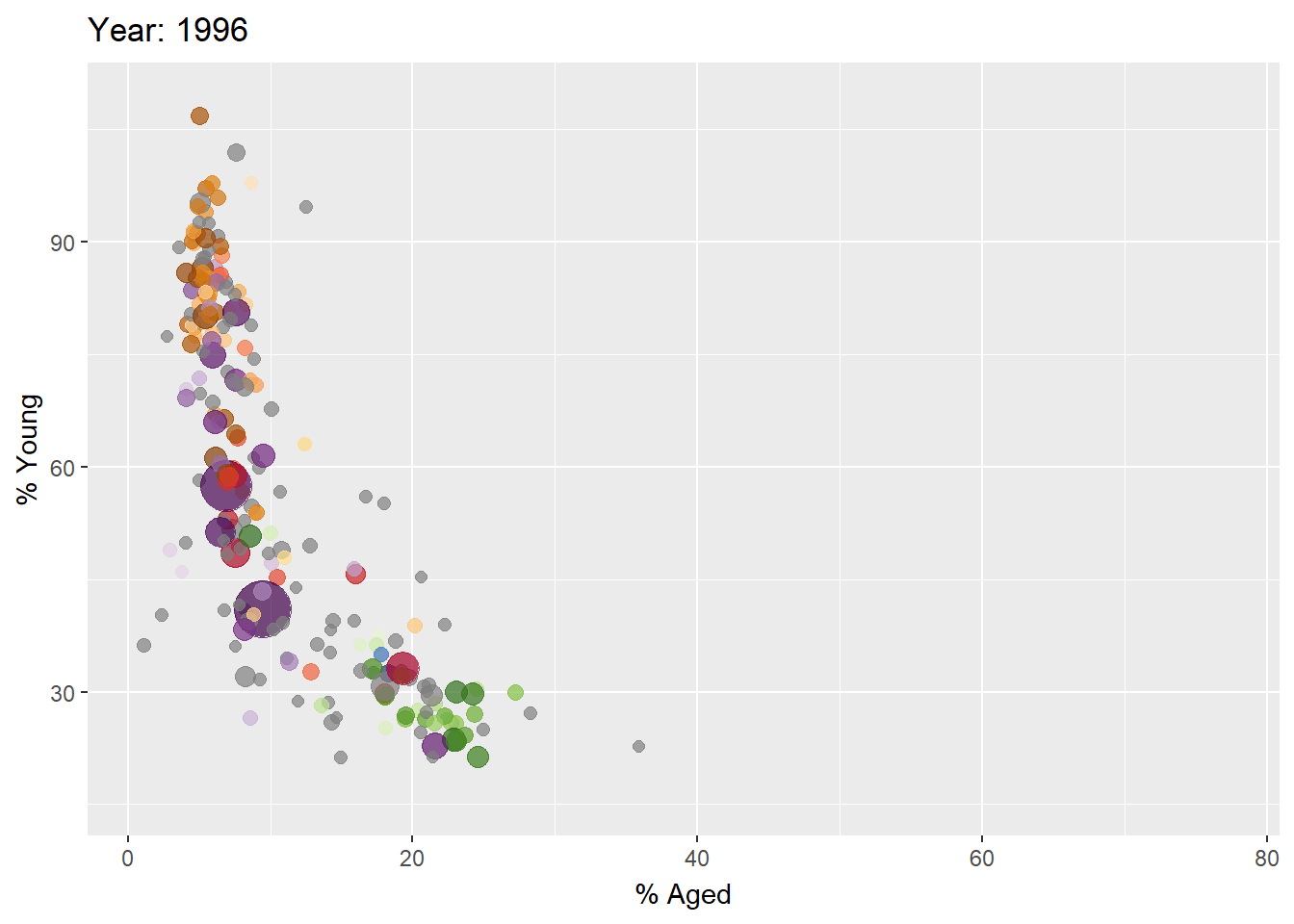
gganimate extends the grammar of graphics as implemented by ggplot2 to include the description of animation. It does this by providing a range of new grammar classes that can be added to the plot object in order to customise how it should change with time.
In the code chunk below, the basic ggplot2 functions are used to create a static bubble plot.
ggplot(globalPop, aes(x = Old, y = Young,
size = Population,
colour = Country)) +
geom_point(alpha = 0.7,
show.legend = FALSE) +
scale_colour_manual(values = country_colors) +
scale_size(range = c(2, 12)) +
labs(title = 'Year: {frame_time}',
x = '% Aged',
y = '% Young') In the code chunk below,
ggplot(globalPop, aes(x = Old, y = Young,
size = Population,
colour = Country)) +
geom_point(alpha = 0.7,
show.legend = FALSE) +
scale_colour_manual(values = country_colors) +
scale_size(range = c(2, 12)) +
labs(title = 'Year: {frame_time}',
x = '% Aged',
y = '% Young') +
transition_time(Year) +
ease_aes('linear') In Plotly R package, both ggplotly() and plot_ly() support key frame animations through the frame argument/aesthetic. They also support an ids argument/aesthetic to ensure smooth transitions between objects with the same id (which helps facilitate object constancy).
ggplotly() methodIn this sub-section, you will learn how to create an animated bubble plot by using ggplotly() method.
Things to learn from the code chunk below
Appropriate ggplot2 functions are used to create a static bubble plot. The output is then saved as an R object called gg.
ggplotly() is then used to convert the R graphic object into an animated svg object.
gg <- ggplot(globalPop,
aes(x = Old,
y = Young,
size = Population,
colour = Country)) +
geom_point(aes(size = Population,
frame = Year),
alpha = 0.7,
show.legend = FALSE) +
scale_colour_manual(values = country_colors) +
scale_size(range = c(2, 12)) +
labs(x = '% Aged',
y = '% Young')
ggplotly(gg) Notice in the previous plot that although show.legend = FALSE argument was used, the legend still appears on the plot. To overcome this problem, theme(legend.position='none') should be used as shown in the plot and code chunk below.
gg <- ggplot(globalPop,
aes(x = Old,
y = Young,
size = Population,
colour = Country)) +
geom_point(aes(size = Population,
frame = Year),
alpha = 0.7) +
scale_colour_manual(values = country_colors) +
scale_size(range = c(2, 12)) +
labs(x = '% Aged',
y = '% Young') +
theme(legend.position='none')
ggplotly(gg) plot_ly() methodIn this sub-section, you will learn how to create an animated bubble plot by using plot_ly() method.
bp <- globalPop %>%
plot_ly(x = ~Old,
y = ~Young,
size = ~Population,
color = ~Continent,
sizes = c(2, 100),
frame = ~Year,
text = ~Country,
hoverinfo = "text",
type = 'scatter',
mode = 'markers'
) %>%
layout(showlegend = FALSE)
bp